FISHproa
Brand identity and packaging for a distributor of fresh, high-quality fish from Colombia's Pacific coast.
- Role
- Brand designer, responsible for concept, identity, packaging and brand guidelines
- Tools
- Illustrator, Photoshop
- Impact
- A fresh, consistent brand across every customer touch point
01 · Problem
A fresh-fish brand that had to look as fresh as its product.
FISHproa distributes fresh, high-quality fish from the Pacific coast of Colombia. It needed a complete brand: an identity, packaging and a way of presenting the product that would always communicate freshness and quality, and that could be applied across many customer touch points, from packaging and print to social media.

02 · Research & insight
Freshness and quality, at a glance, everywhere.
With fresh food, people judge quality in seconds. The brand had to feel clean, coastal and trustworthy, and be simple enough to stay consistent wherever it appeared.
- Insight 01 Customers judge freshness and quality at a glance.
- Insight 02 Packaging, print and digital all had to carry the same feeling.
- Insight 03 The brand had to be easy to apply consistently by others.
03 · Solution
A clean, coastal identity, with fresh ingredients at the heart of the visuals.
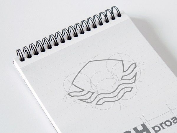
A symbol from the sea
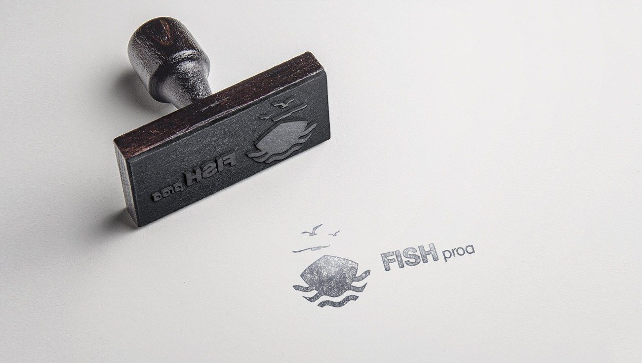
The symbol brings together the bow of a fishing boat, the waves and the seagulls of the Pacific coast, built from simple geometry so it works at any size.
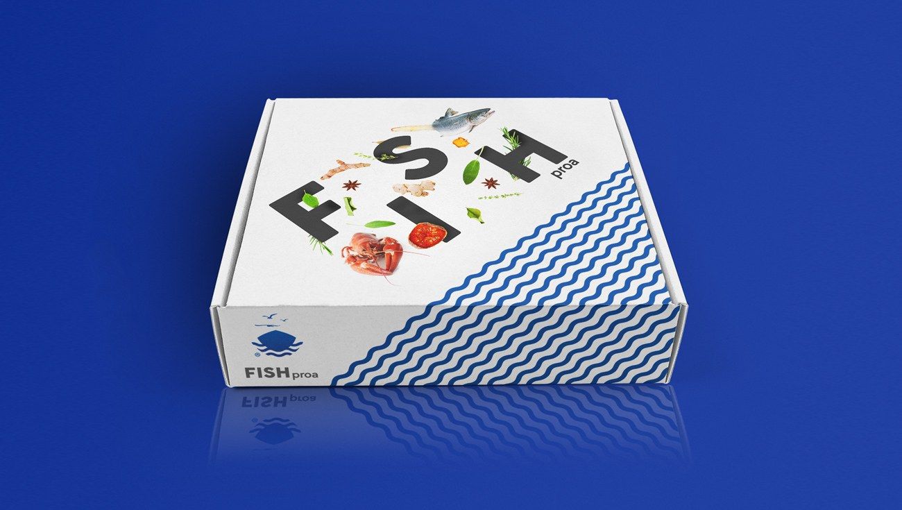
Packaging that sells freshness
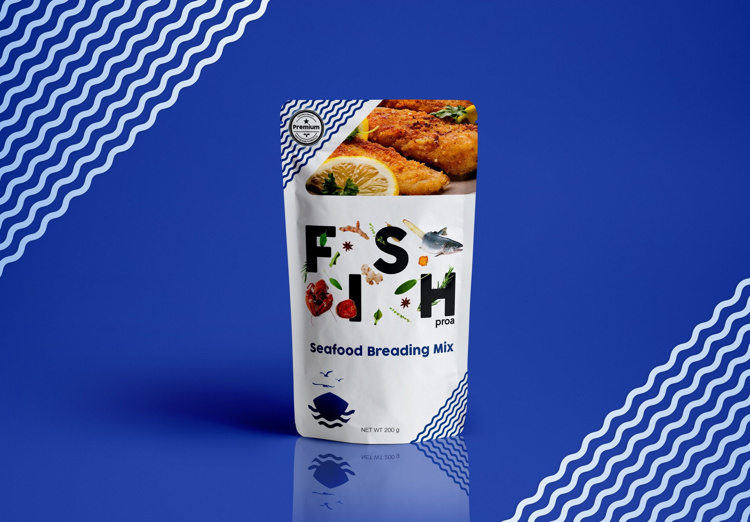
Deep ocean blue, a white wave pattern and fresh ingredients bring the product to life on boxes and pouches, so it stands out on the shelf and feels high quality.
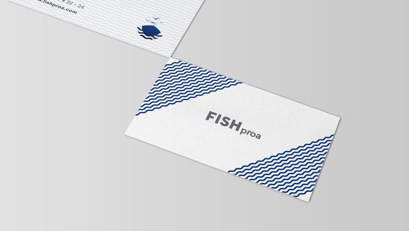
A system for every touch point
The wave pattern, colours and logo carry the brand across stationery, business cards and other applications, set out in brand guidelines so it stays consistent.
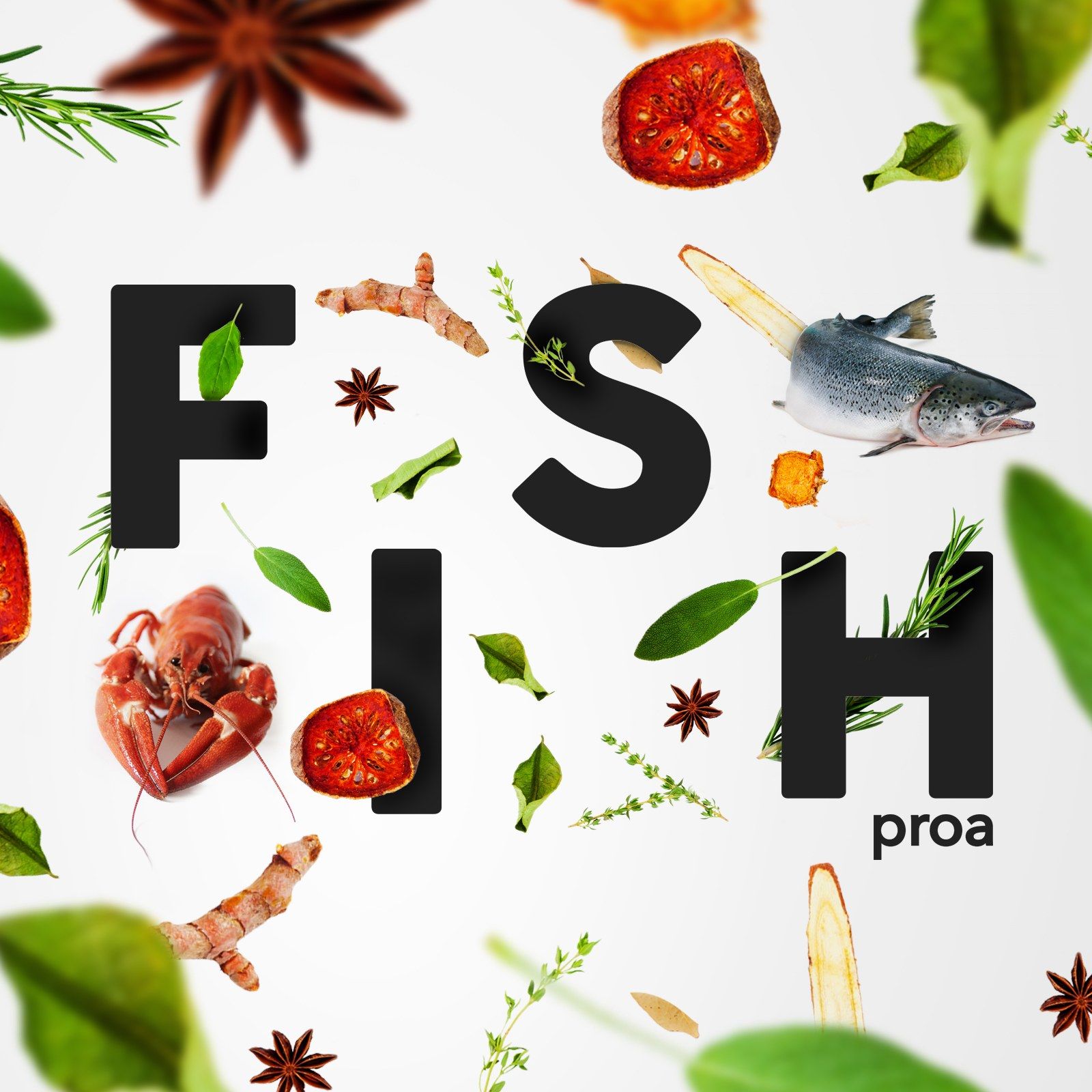
Detailed assets for campaigns and social
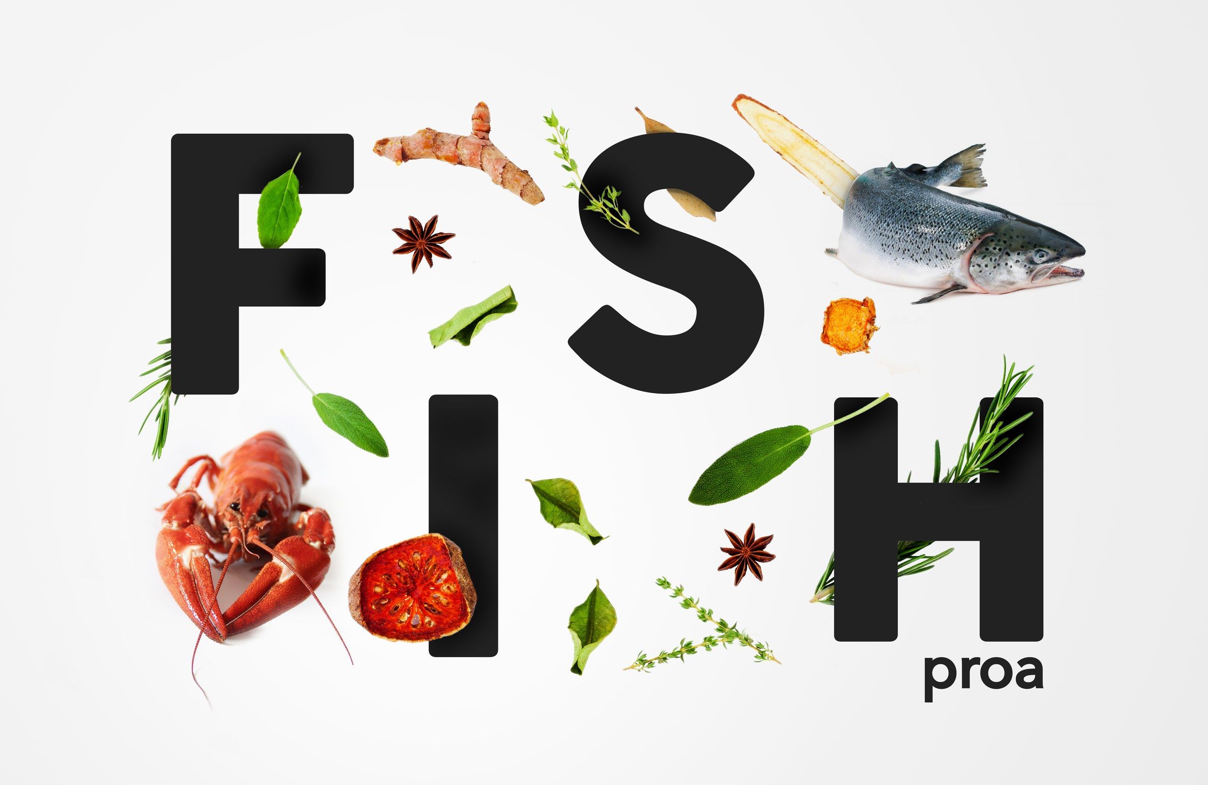
I created detailed assets, such as the wordmark built from fresh ingredients, that work in campaigns and on social media while keeping the fresh, high-quality look.
04 · Impact
A complete brand and guidelines, applied consistently from packaging to social media.
05 · Reflection
What I’d take forward
Building a brand from scratch showed me how much a consistent system matters for a growing business. A clear symbol, a recognisable pattern and a few simple rules meant the brand could look fresh and premium on a box, a business card or a social post, without starting again each time.