Fujitsu & NatWest
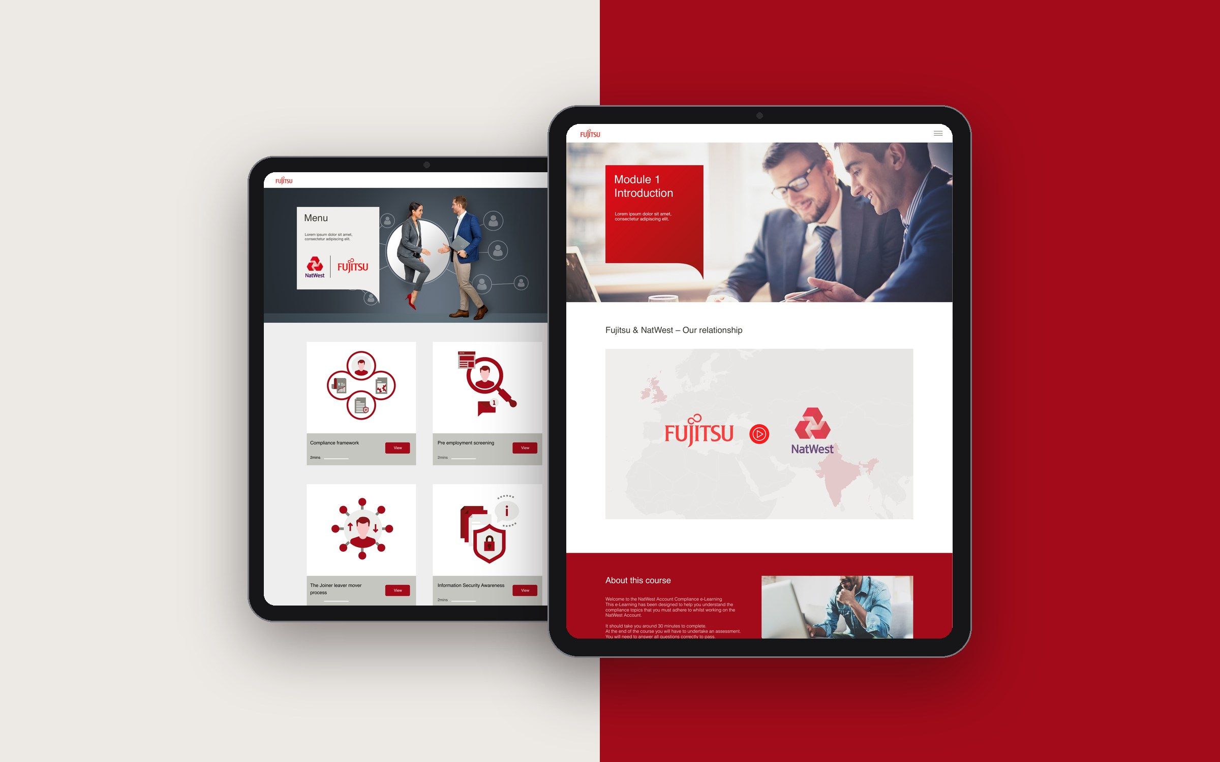
The look and feel for a Fujitsu learning solution, from NatWest account compliance to Azure sales training, built on the client's brand guidelines.
- Role
- Digital designer, responsible for the look and feel, UI and UX
- Impact
- A visual guide for every asset in the solution
01 · Problem
A learning solution that had to feel unmistakably like the client's brand.
Fujitsu needed a look and feel for its e-learning, including a compliance course for people working on the NatWest account and training for its Azure sales teams. It had to follow the client's brand guidelines closely and speak in the brand's tone, while being engaging enough to keep learners moving through the content.
02 · Research & insight
Starting from the client's brand guidelines.
I worked from the client's brand guidelines, covering colour, typography, imagery and tone, and translated them into a style that works for interactive learning rather than marketing.
- Insight 01 The brand guidelines set the colours, type, imagery and tone.
- Insight 02 Learning needs more than branding: clear structure and interactions.
- Insight 03 The style had to guide every asset produced for the solution.
03 · Solution
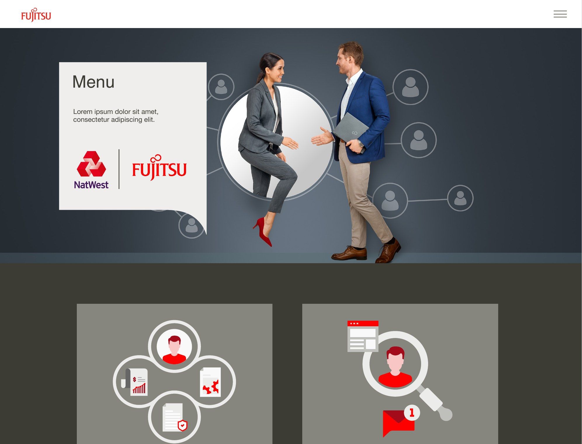
A look and feel built on the brand, with graphics that guide every asset in the solution.
On brand and in tone
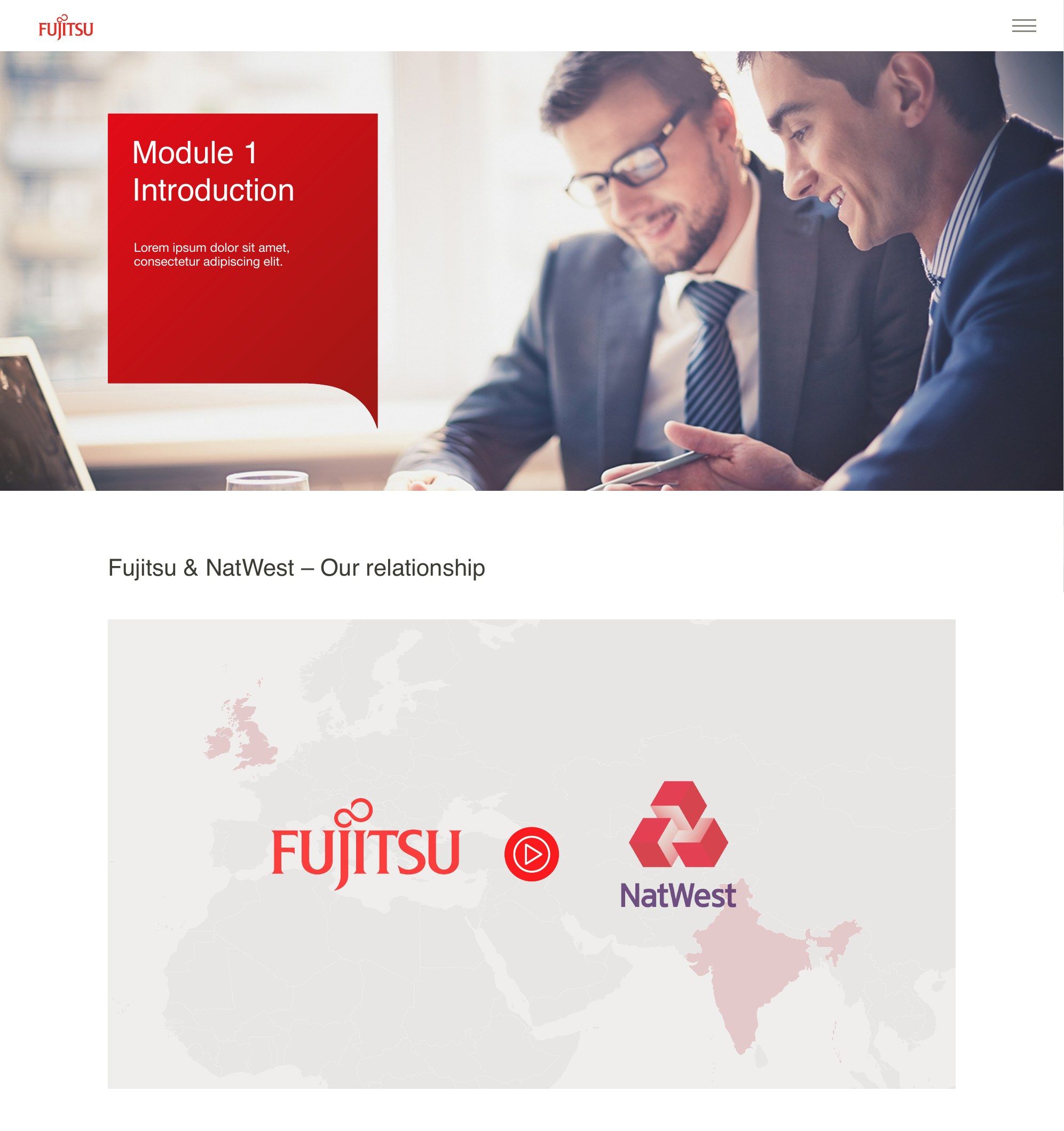
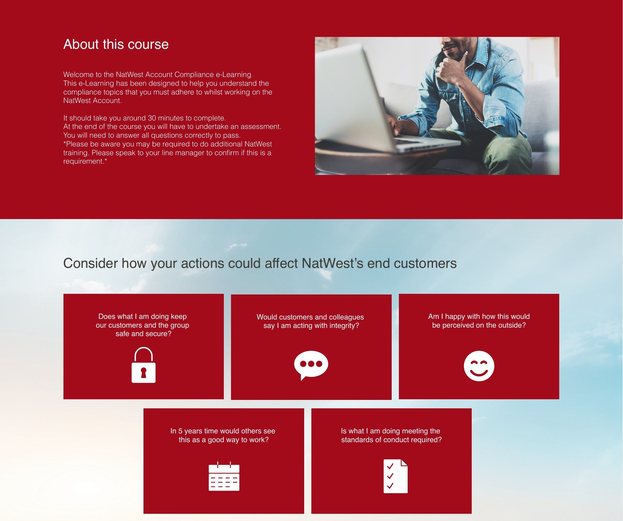
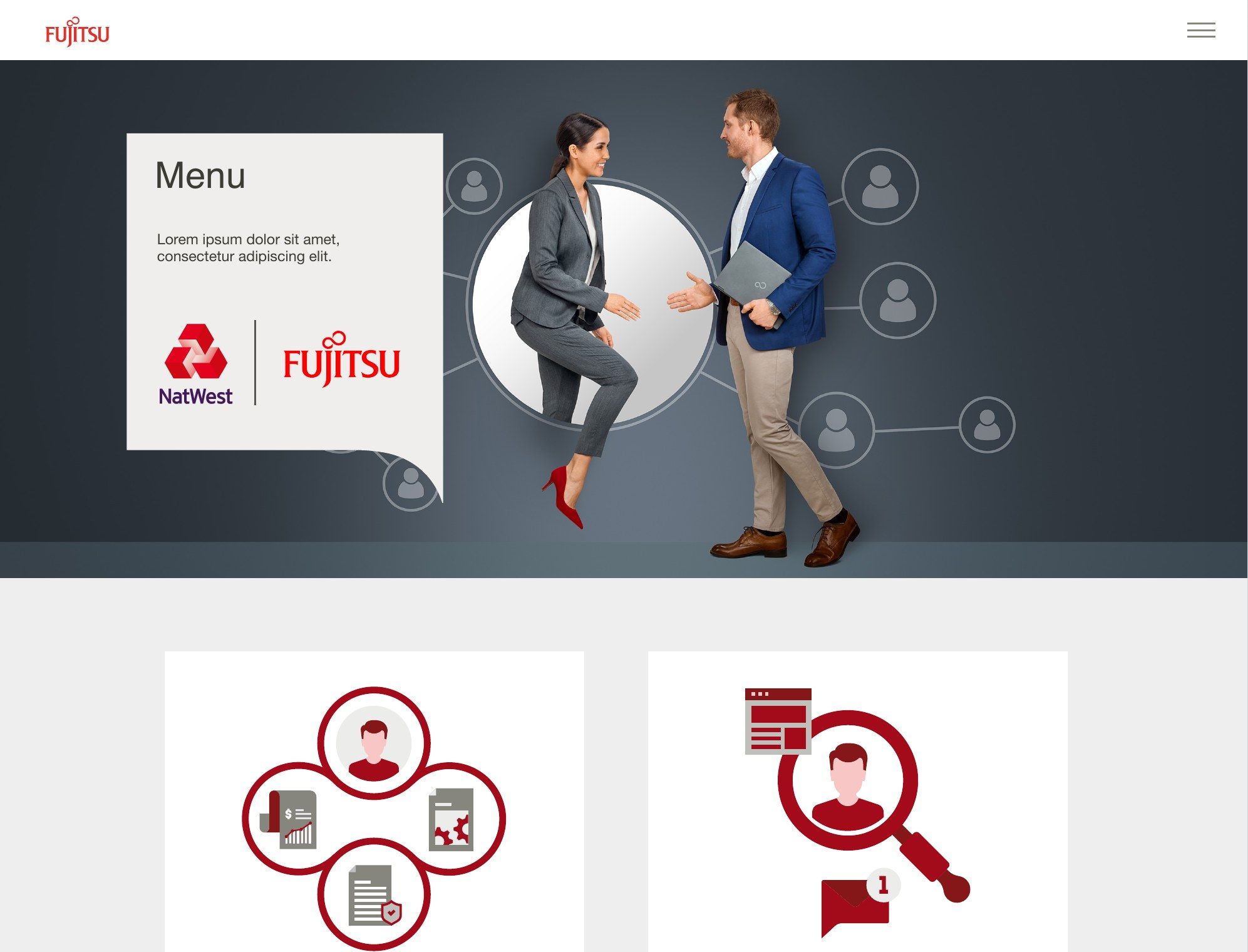
Brand red, clean typography and real-life photography carry the brand into every screen, from the course introduction to reflective activities about how actions affect NatWest's customers.
Graphics as a guide for every asset
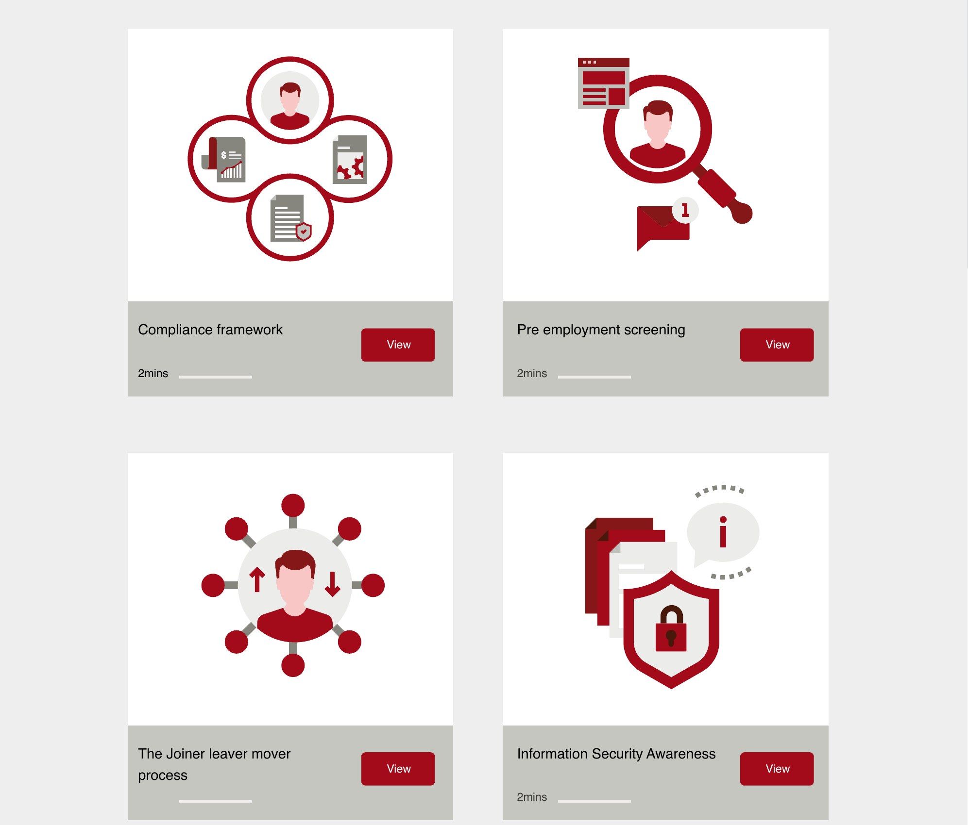
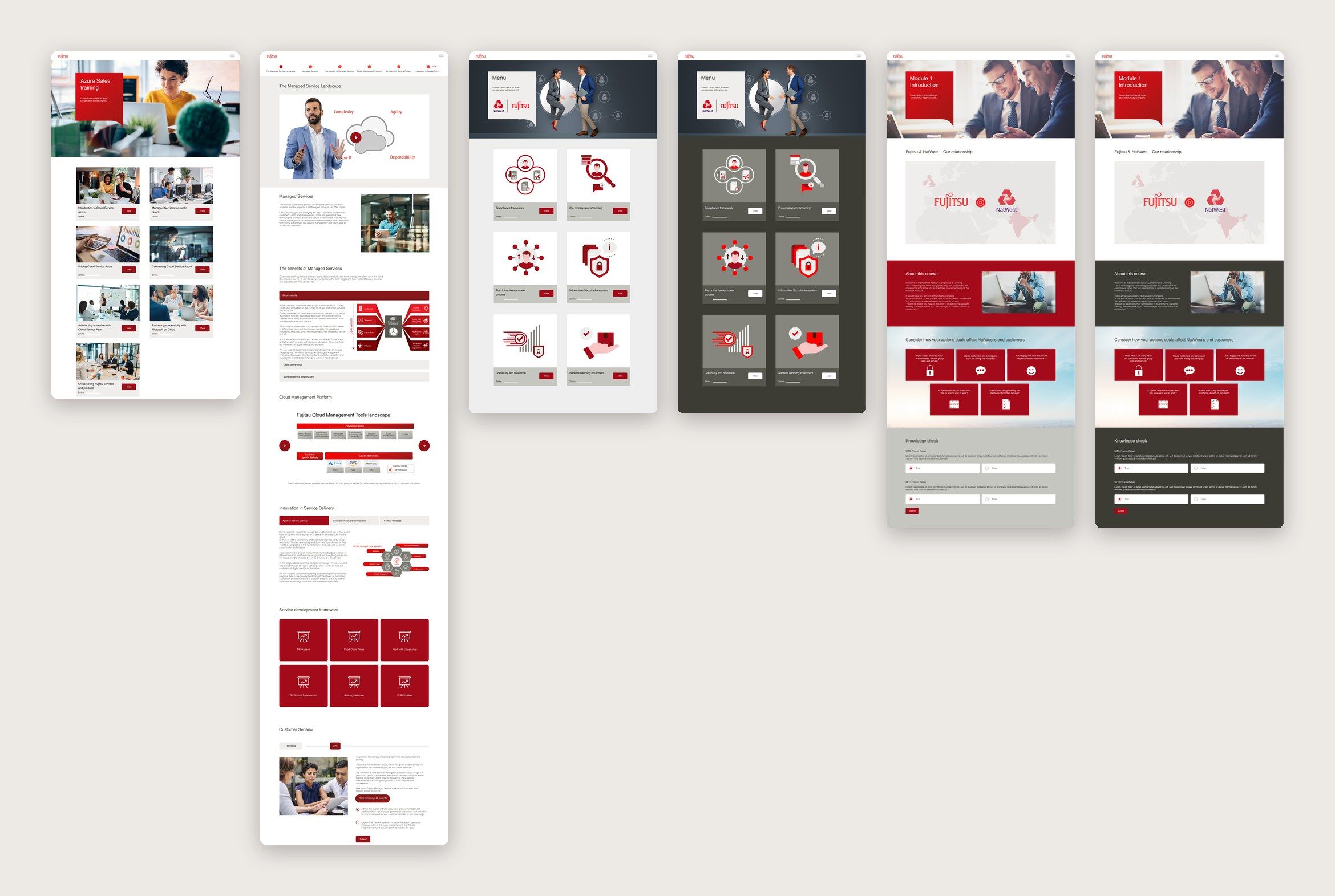
I created a set of illustrated icons and graphics that show how assets across the whole solution should look, so the rest could be produced in the same style.
UI and UX shaped by the brand
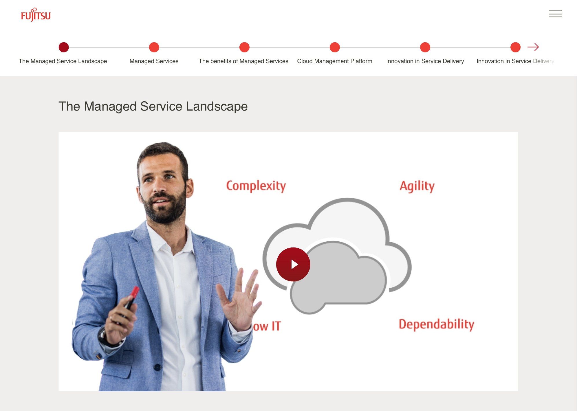
Progress navigation, clear section headings and video moments keep learners oriented through long modules, all within the brand guidelines.
Interactions that keep learners engaged
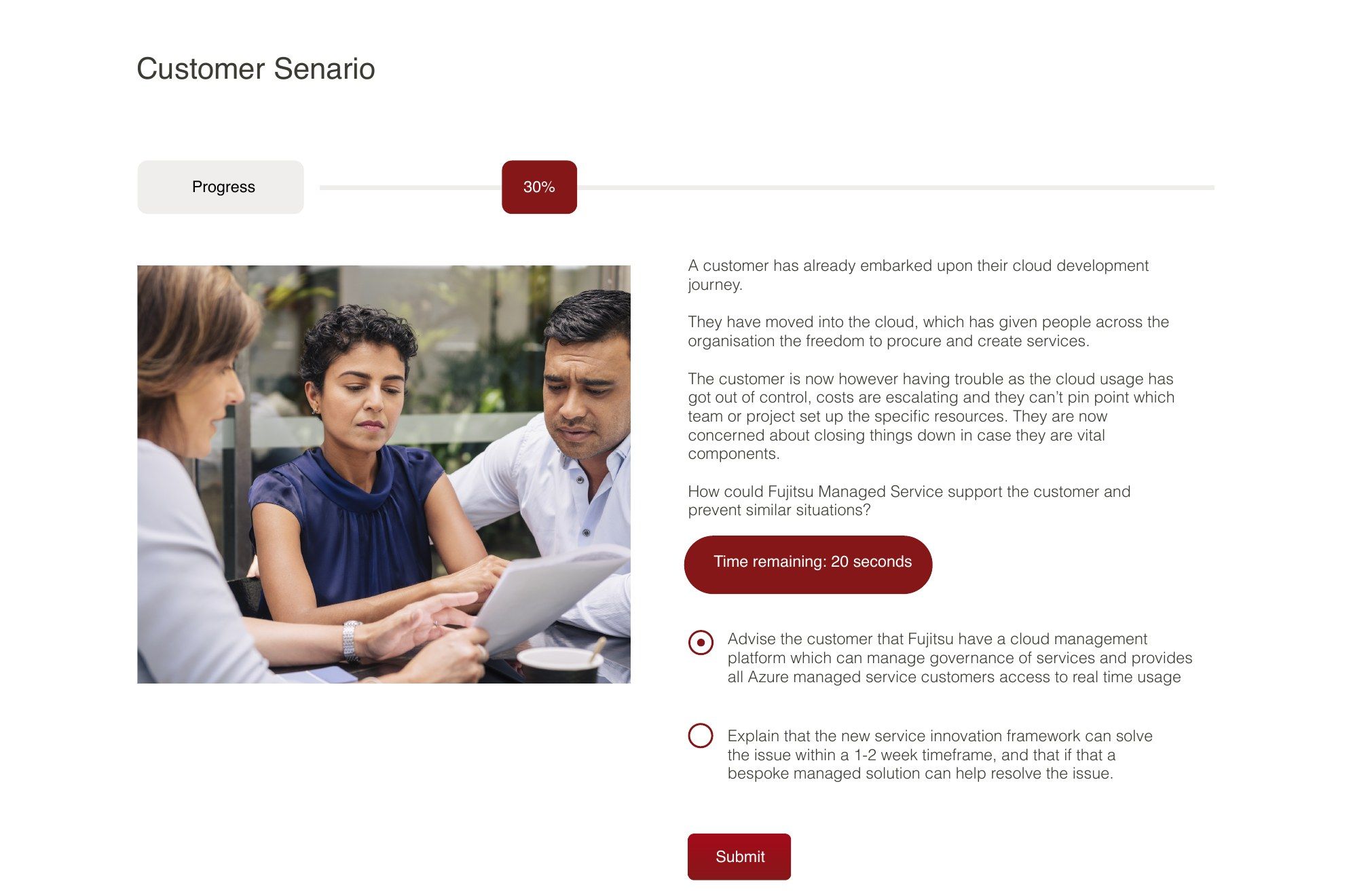
Customer scenarios, timed questions and knowledge checks turn the content into decisions learners have to make.
04 · Impact
A look and feel, and an asset guide, used to build the learning solution in the client's brand.
05 · Reflection
What I’d take forward
Working inside another company’s brand guidelines taught me to find creativity in the details: how layout, imagery and interaction can make learning engaging while staying unmistakably on brand.