Cloud Academy
A digital content style guide that aligned Cloud Academy with QA after the acquisition, so the whole team could create cohesive, on-brand content.
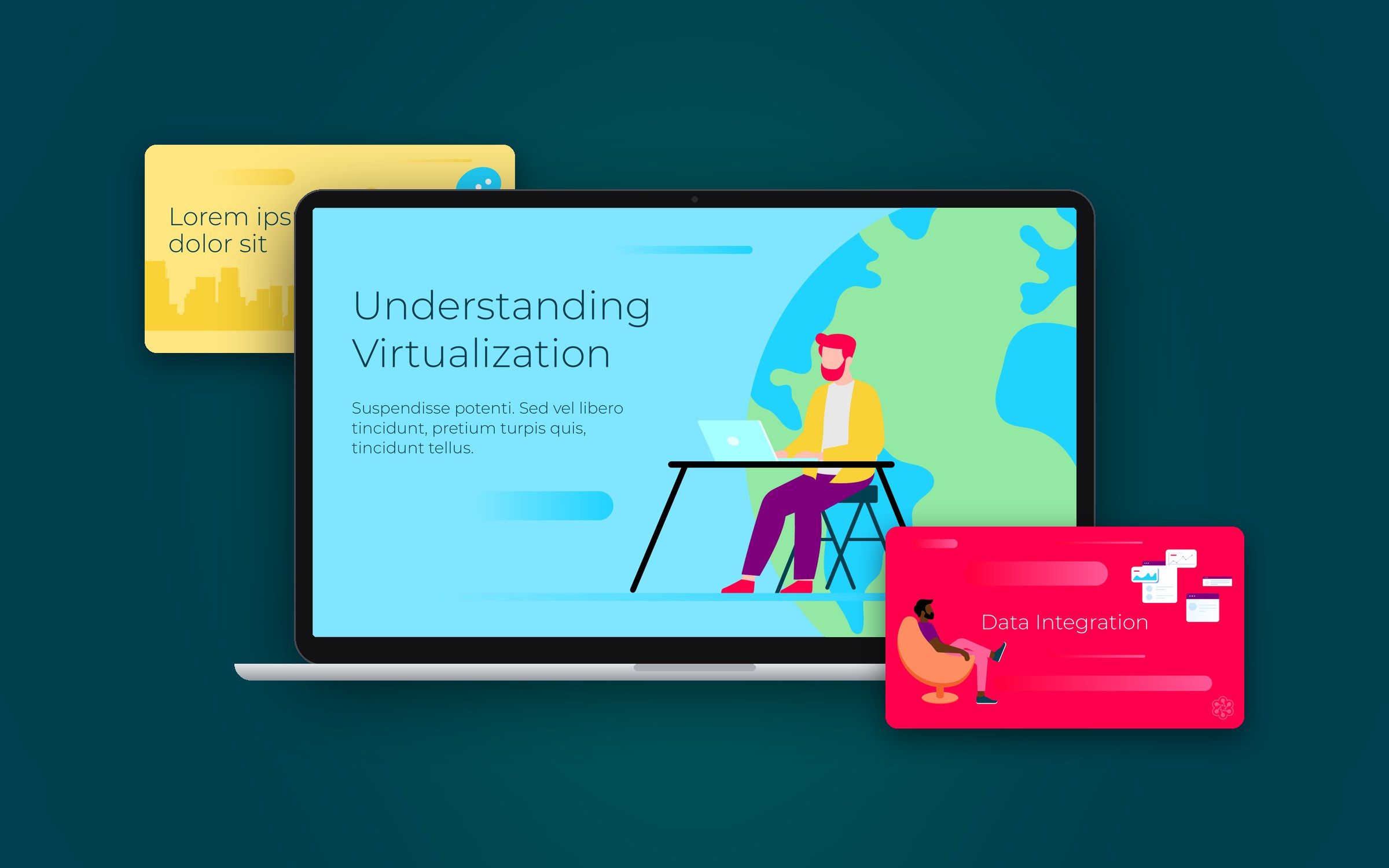
- Role
- Digital designer; I came up with and created the whole style guide
- Team
- Graphic designers, production team managers and project managers
- Tools
- Illustrator, Photoshop
- Impact
- One design system for all Cloud Academy content
01 · Problem
Two brands coming together, and content that needed to feel like one.
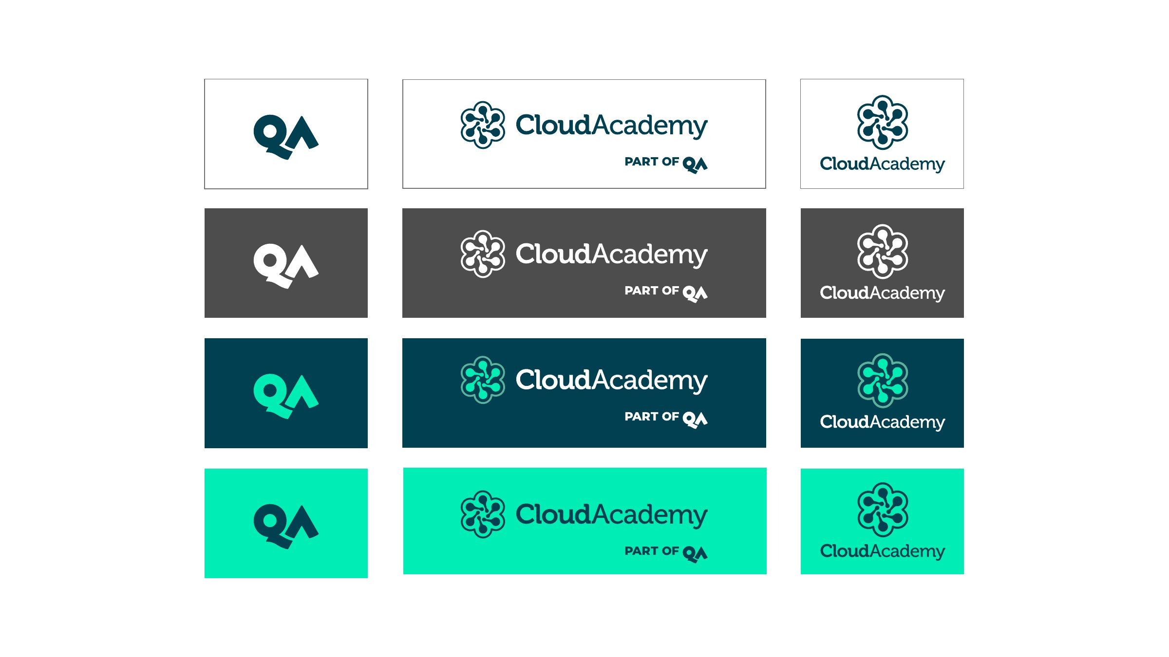
Cloud Academy is a cloud computing training platform based in San Francisco, acquired in 2019 by QA, a UK provider of technical training. As part of bringing the two companies together, Cloud Academy's content needed to align with the QA brand while keeping its own identity. Our team creates a large amount of content for the brand, so it needed a shared way of working to keep everything cohesive.
02 · Research & insight
Three principles behind every decision.
I came up with the project and set out three design principles as the foundation of the guide. Every part of the system, from colour to characters, was checked against them.
- Insight 01 Efficiency: everything should help the whole team work efficiently.
- Insight 02 Adaptability: everything should be adaptable, so it works in any kind of content.
- Insight 03 Simplicity: everything should be simple and bring the story to life.
03 · Solution
A complete design system for content, from colour and type to illustration, characters and animation.
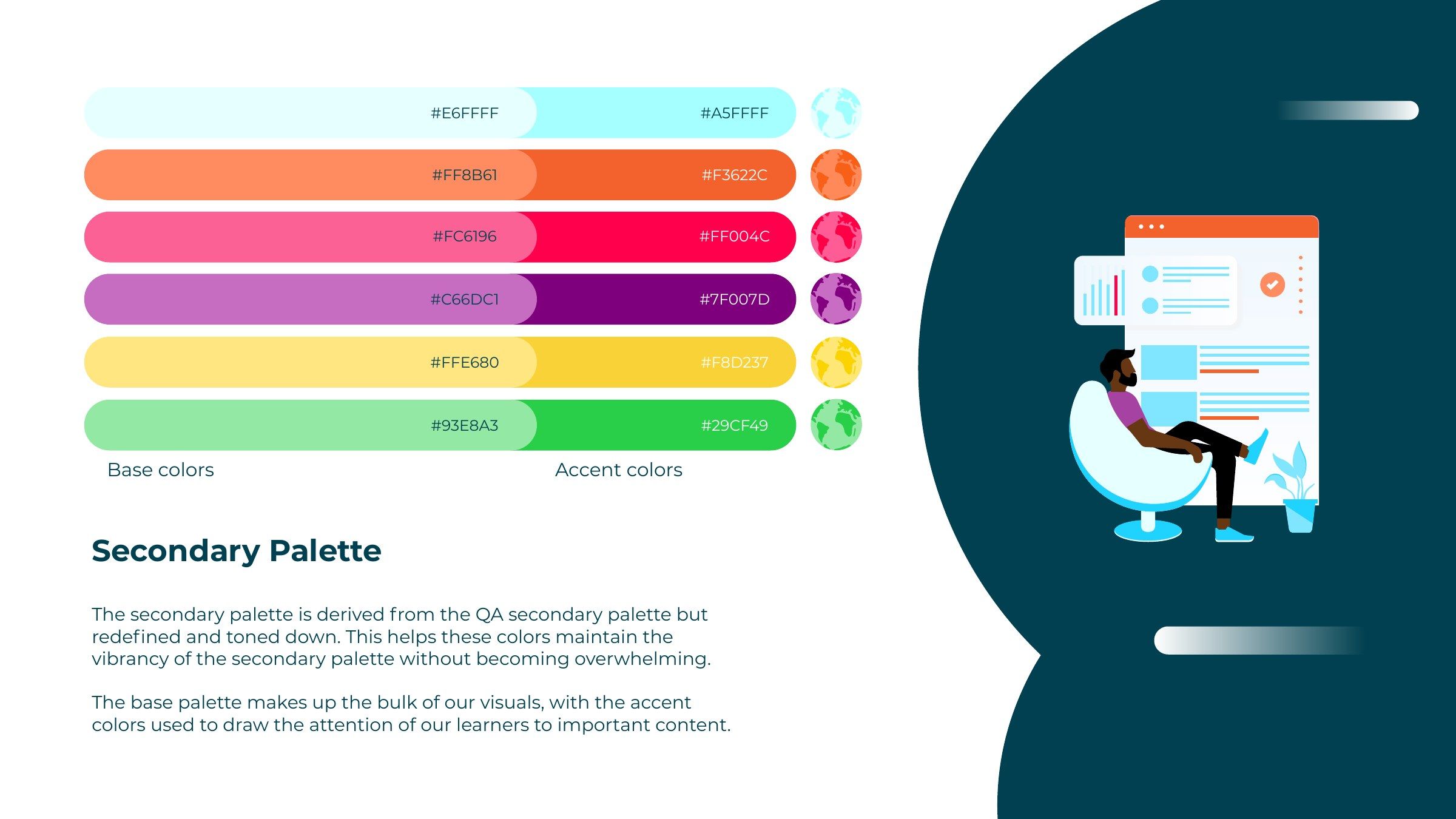
Colour aligned with QA
To bring Cloud Academy closer to QA, I set a simple primary blue as the base of all content, paired with QA's corporate colours and a vibrant secondary palette for illustrations and highlights.
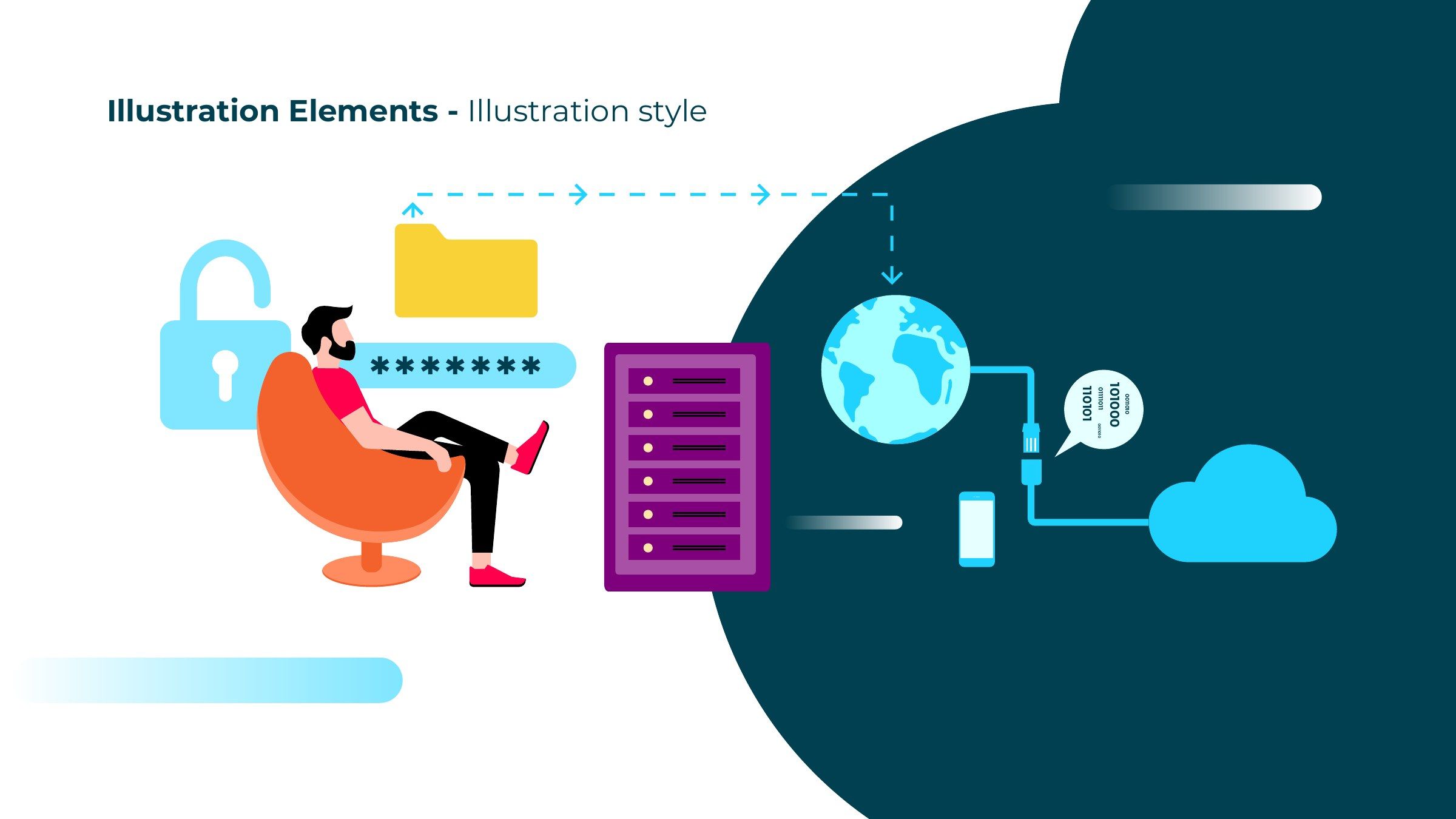
An illustration system made of reusable parts
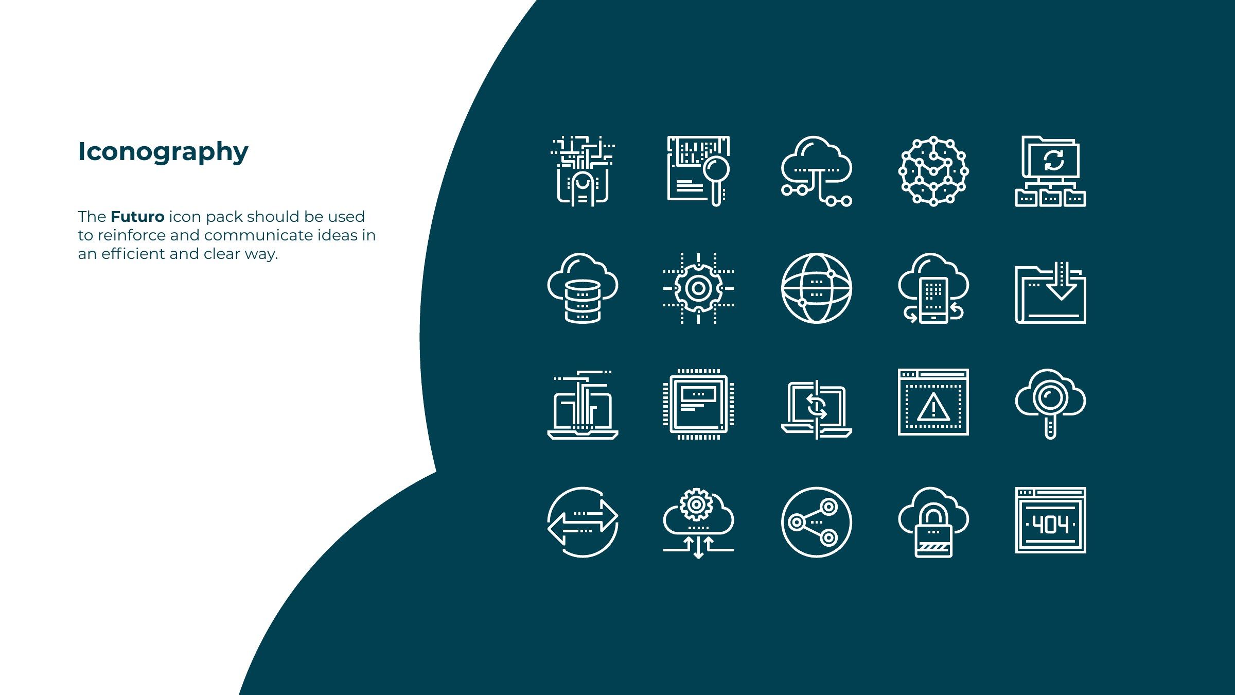
Illustrations are simple and flat, built from elements such as devices, windows, connectors and brand shapes that can be edited and combined to explain any idea. They're easy to animate, and avoiding 3D means everything can be reused in future scenes.
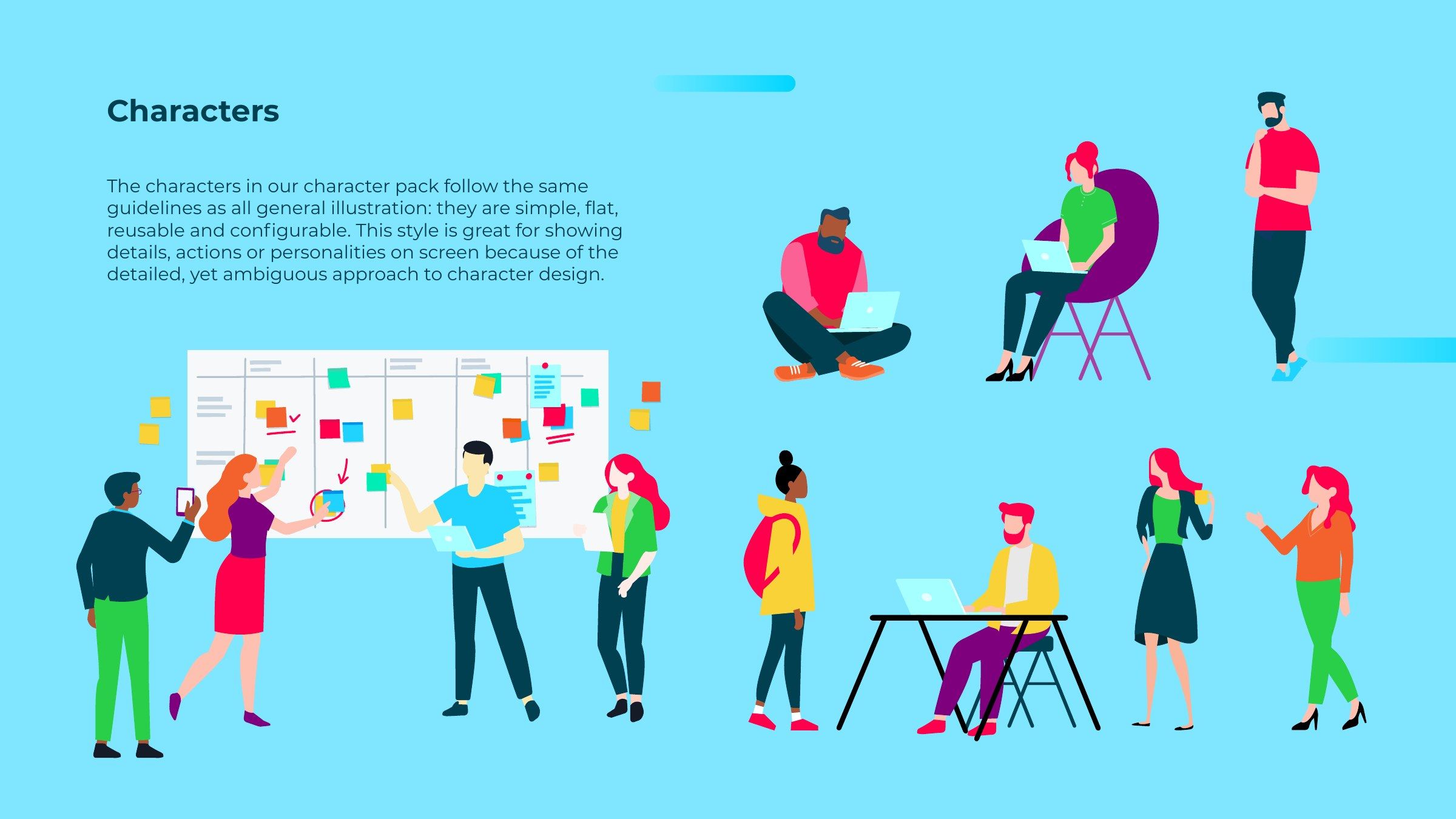
A character pack
Characters follow the same rules: simple, flat and configurable, so they can show actions and personality on screen in any scene.

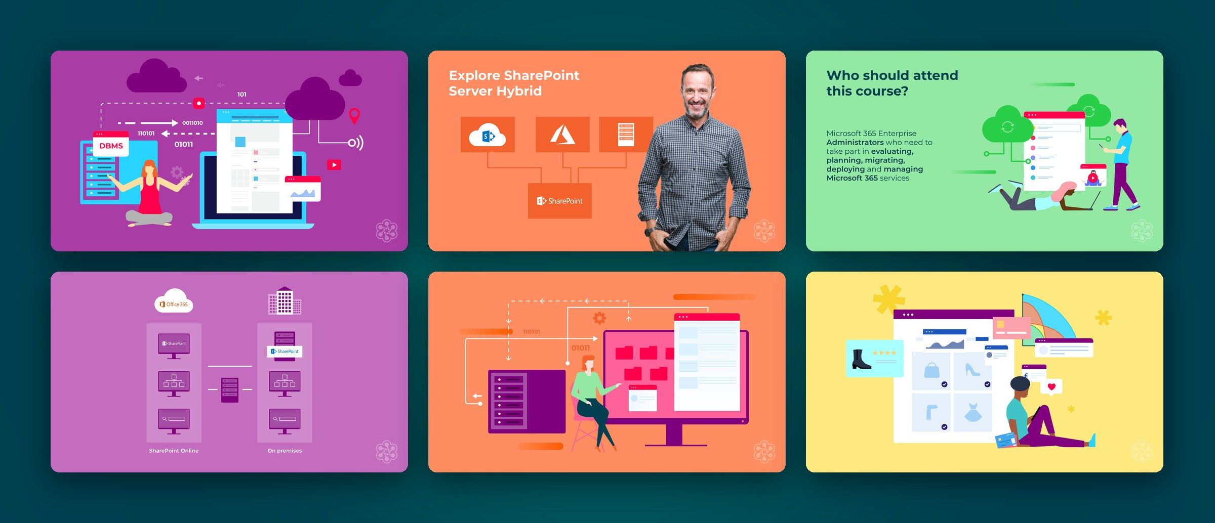
Screen types for video and animation
I designed the animation style and a set of screen types for video, from title screens to key facts, so animated content could be produced quickly and look consistent.
04 · Impact
One style guide the team used to keep Cloud Academy content consistent as the two companies came together.
05 · Reflection
What I’d take forward
Merging two brands can be hard on the people living through it. Design gave everyone something concrete to work from: a shared visual language that helped two companies take the next step together, and let the team keep creating with confidence through the transition.